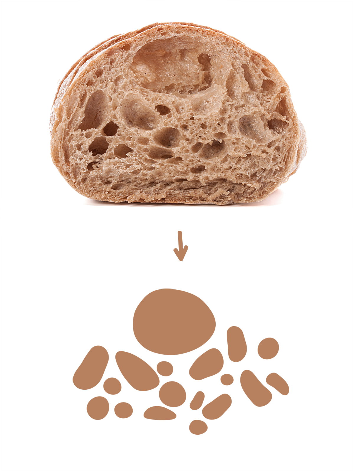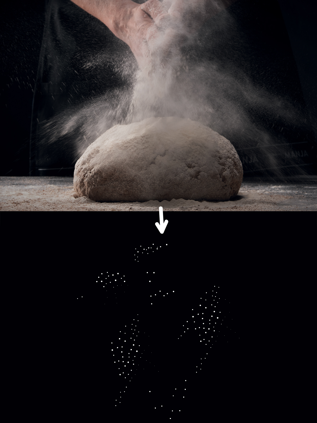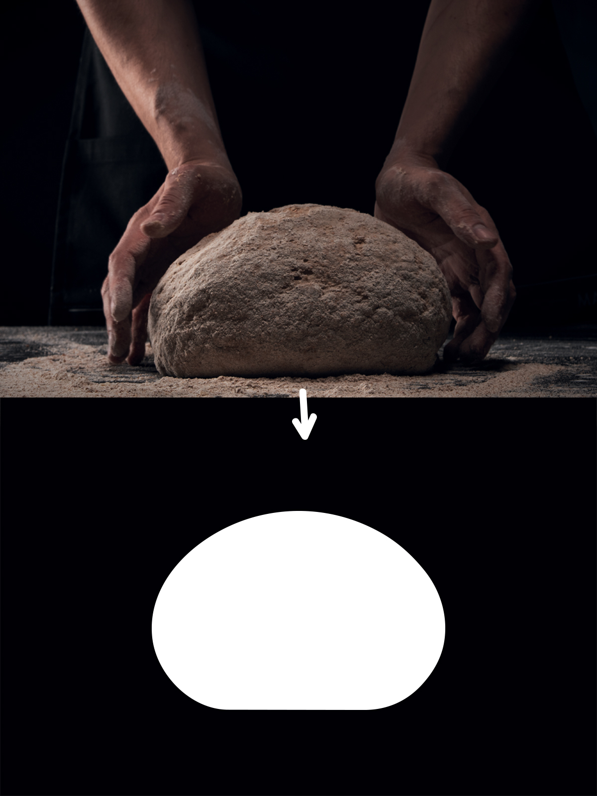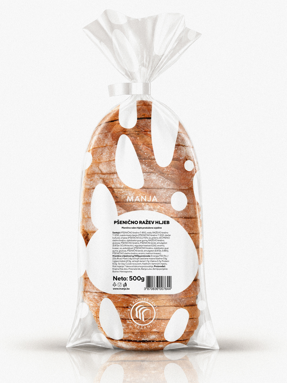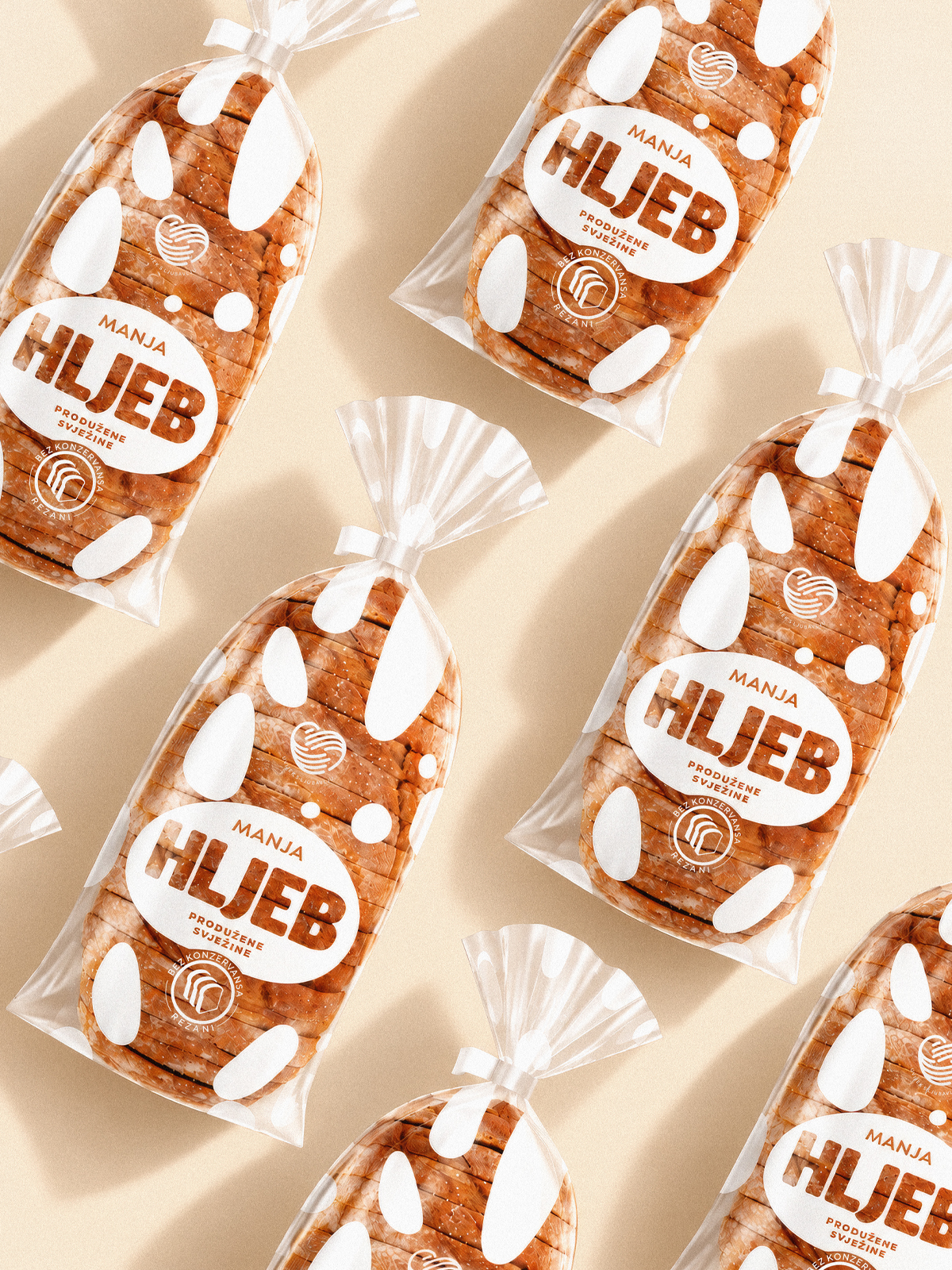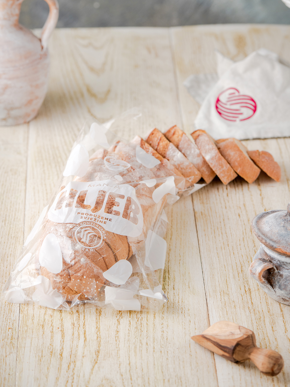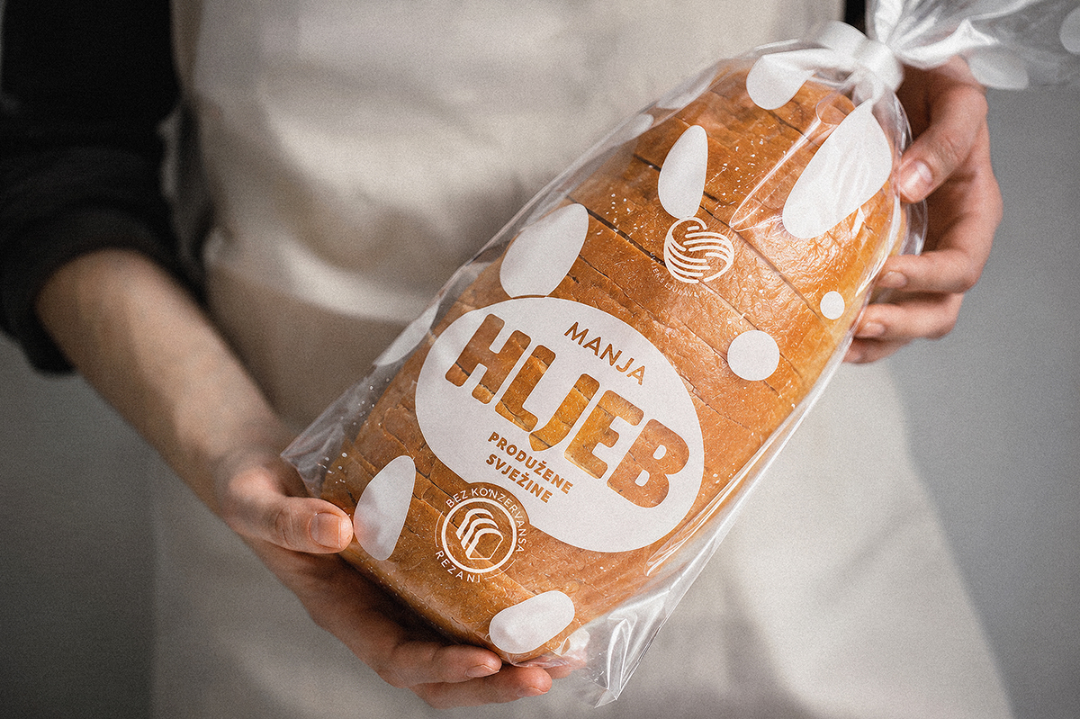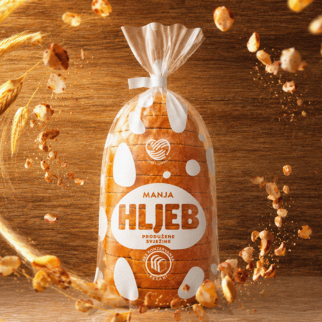
Sometimes, the best inspiration lies within the product itself. In this case, we found it in the texture of bread, its airy structure, flour, and the irregular shapes of loaves formed during the bread-making process.
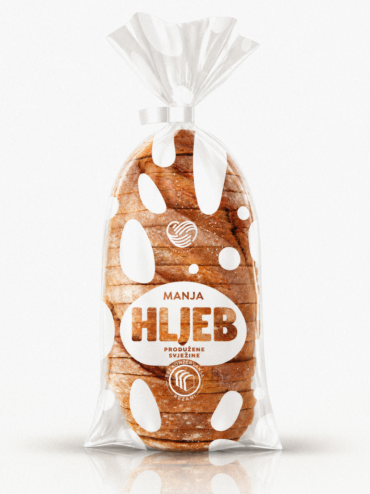
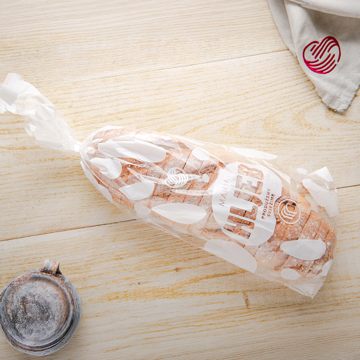
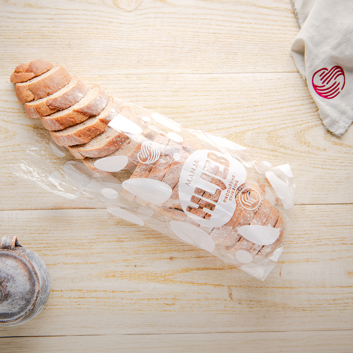
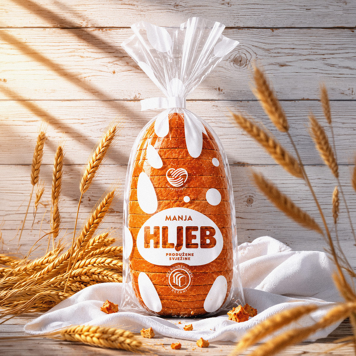
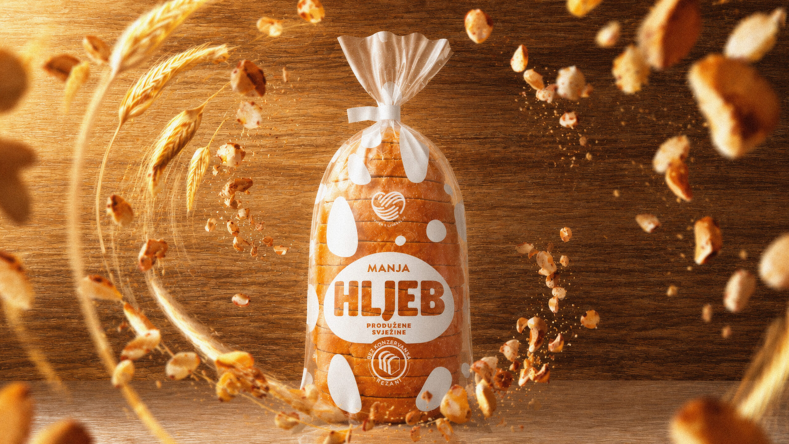
These very shapes became the foundation of a new packaging identity for Manja’s range of sliced, extended-freshness bread. Transformed into simple, organic graphic elements, they create a playful and distinctive visual rhythm across the transparent packaging, allowing the product itself to take center stage.
The minimalist approach, carefully balanced interplay of white and transparent areas, and clear typography create a contemporary design that highlights both the product’s natural qualities and its familiar place in consumers’ everyday lives.
The result is packaging that doesn’t try to tell a complicated story. Instead, through a simple visual language, it reveals something that has always been there, the beauty of bread from within.
Client: Manja / Krajina Klas
Photography: Bojan Crnokrak @crnokrak.bojan