A Year Made with Love
Back in 1995, the internet was only beginning its commercial expansion, Toy Story was the movie of the year, and DVD players represented the future of technology. That same year, Manja was born—a brand that would go on to become synonymous with quality bakery and confectionery products in Bosnia and Herzegovina.
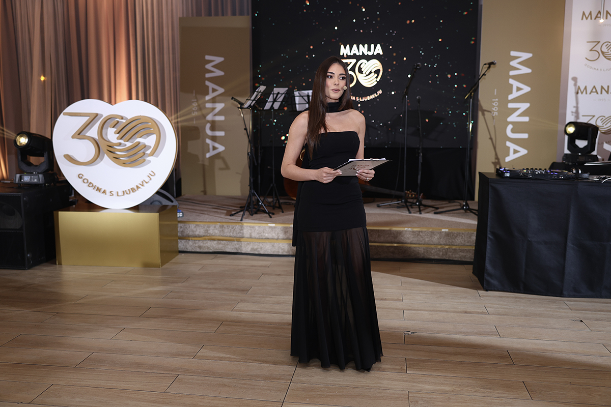
Thirty years later, Manja celebrated an important milestone—not only as a remarkable business achievement, but also as an opportunity to thank everyone who has been part of its journey. Employees, partners, and generations of customers who have built a relationship of trust with the brand over the years.
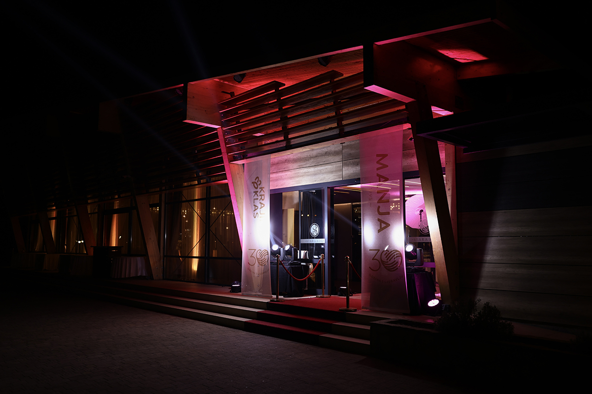
To mark this special occasion, a complete anniversary identity was developed to accompany all activities throughout the celebration of Manja’s 30th anniversary.
A Symbol of Three Decades
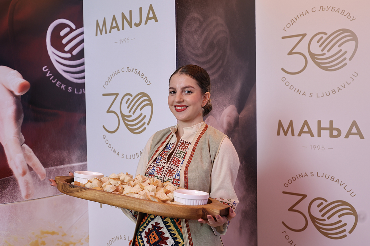
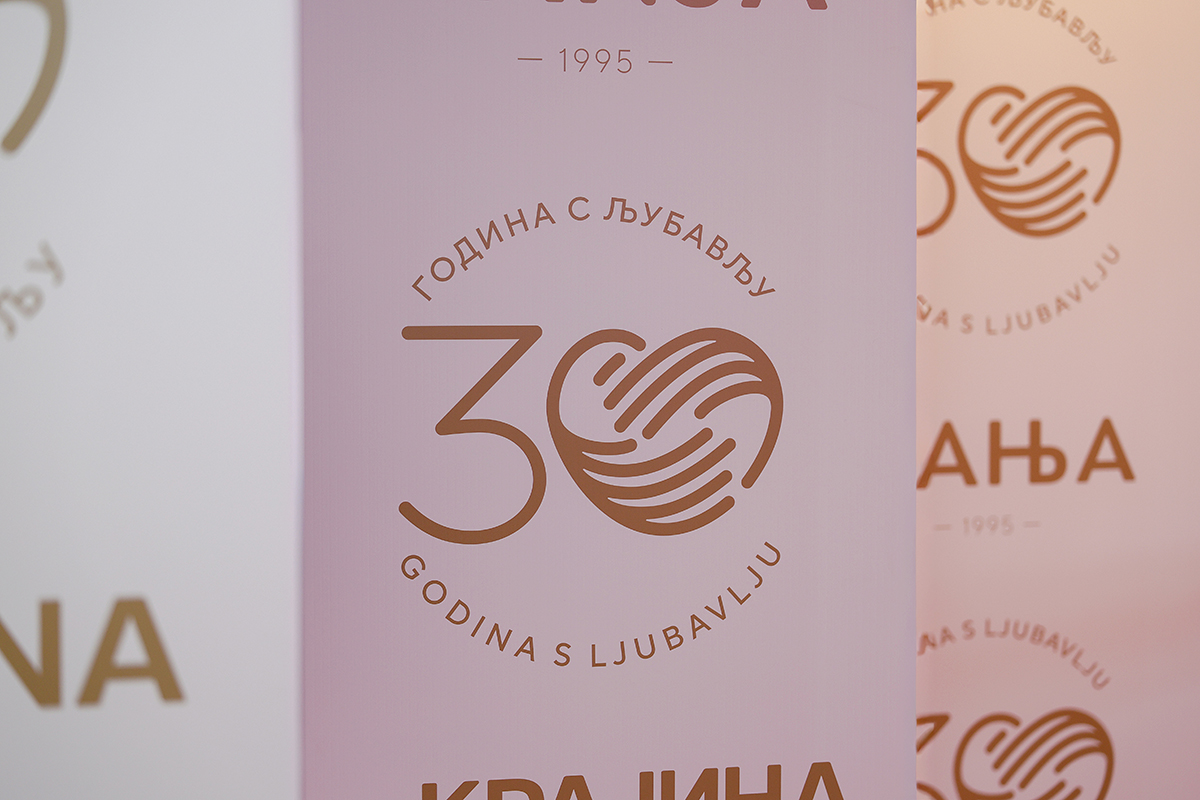
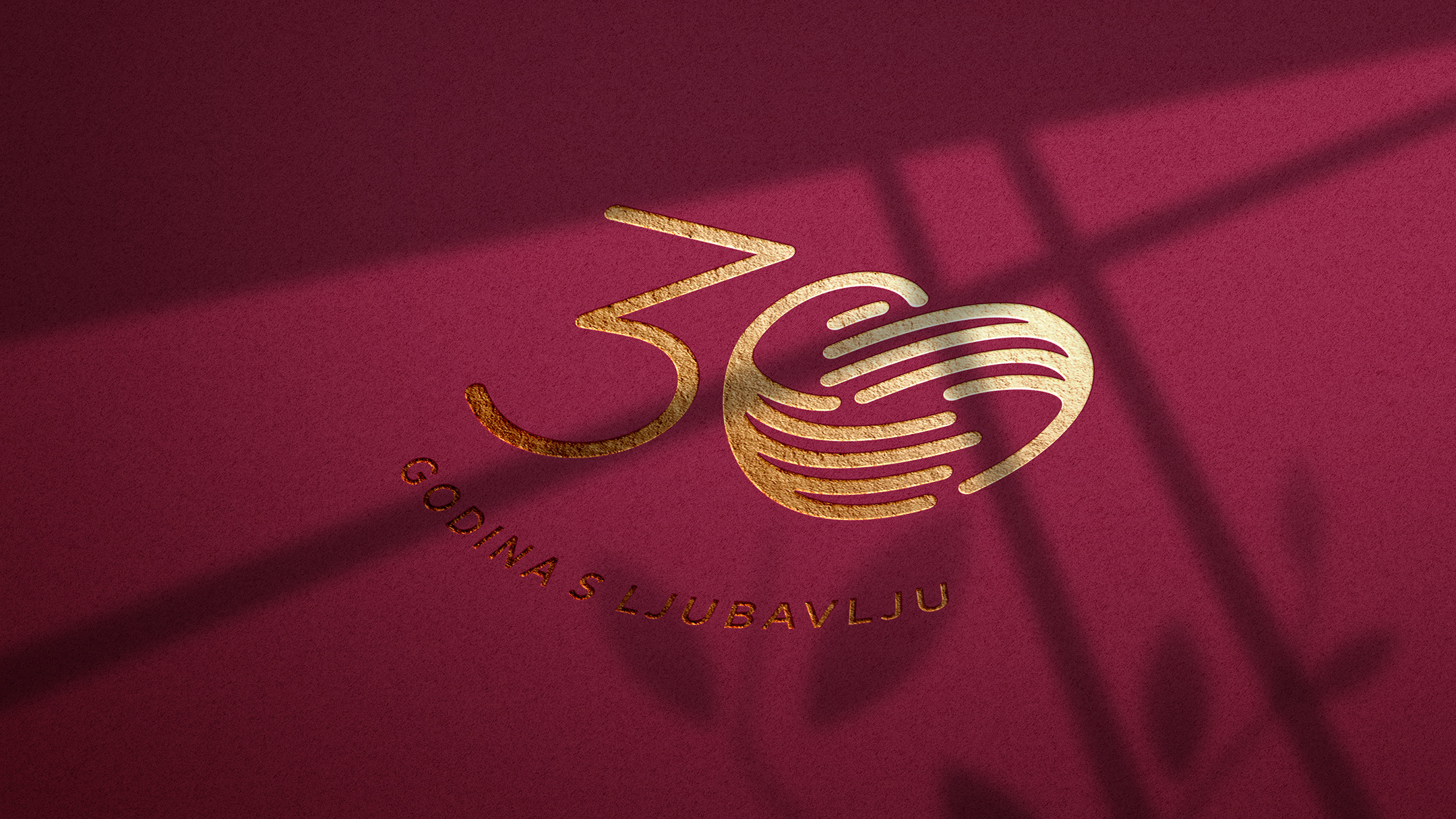
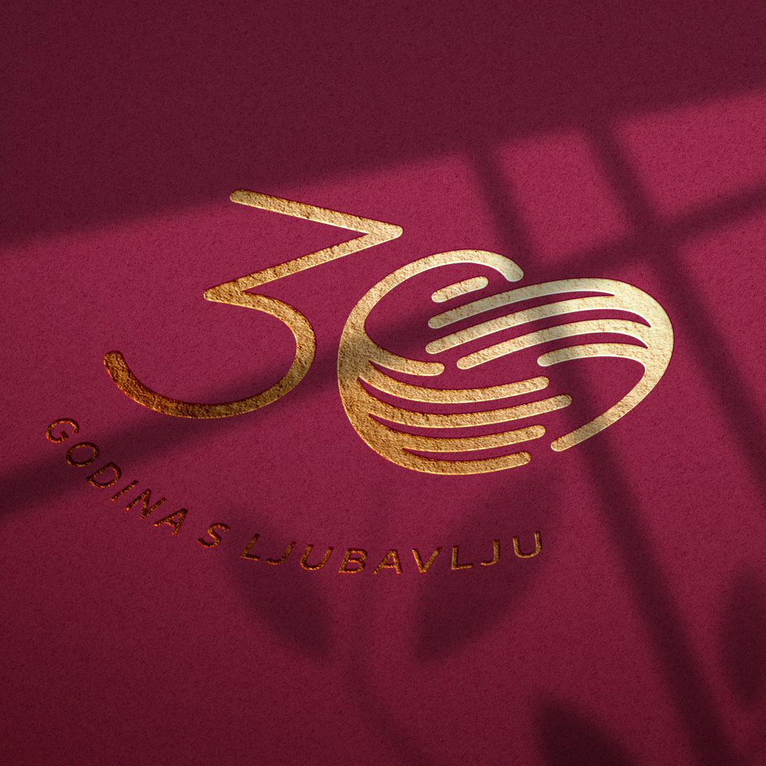
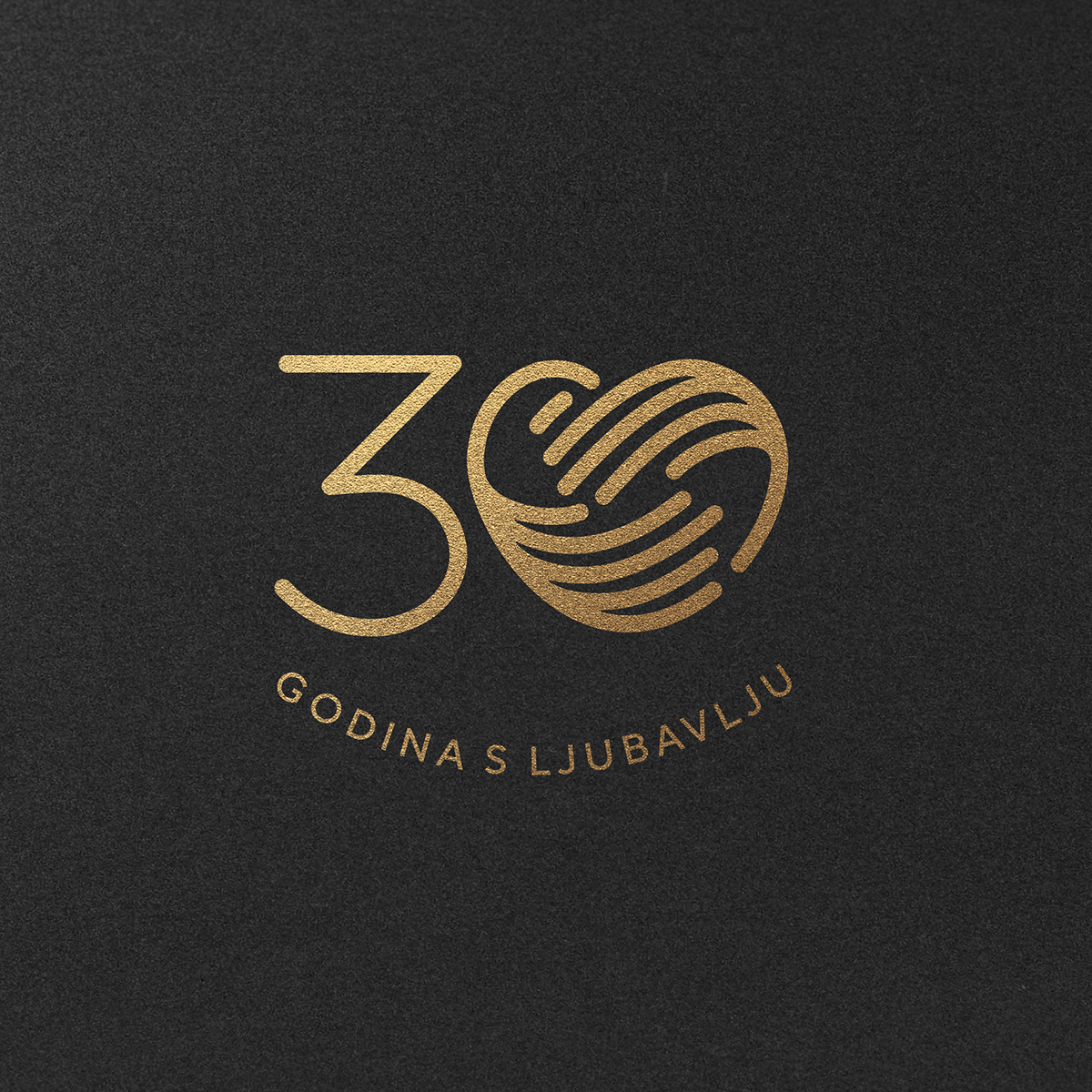
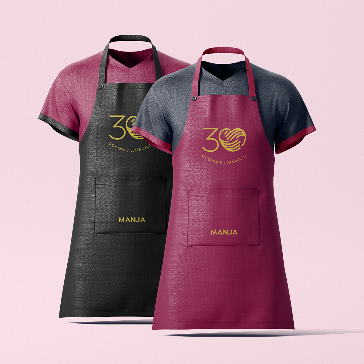
The starting point for the anniversary identity was the most recognizable element of the Manja brand—the symbol of stylized hands that has represented the idea of creating “always with love” for many years.
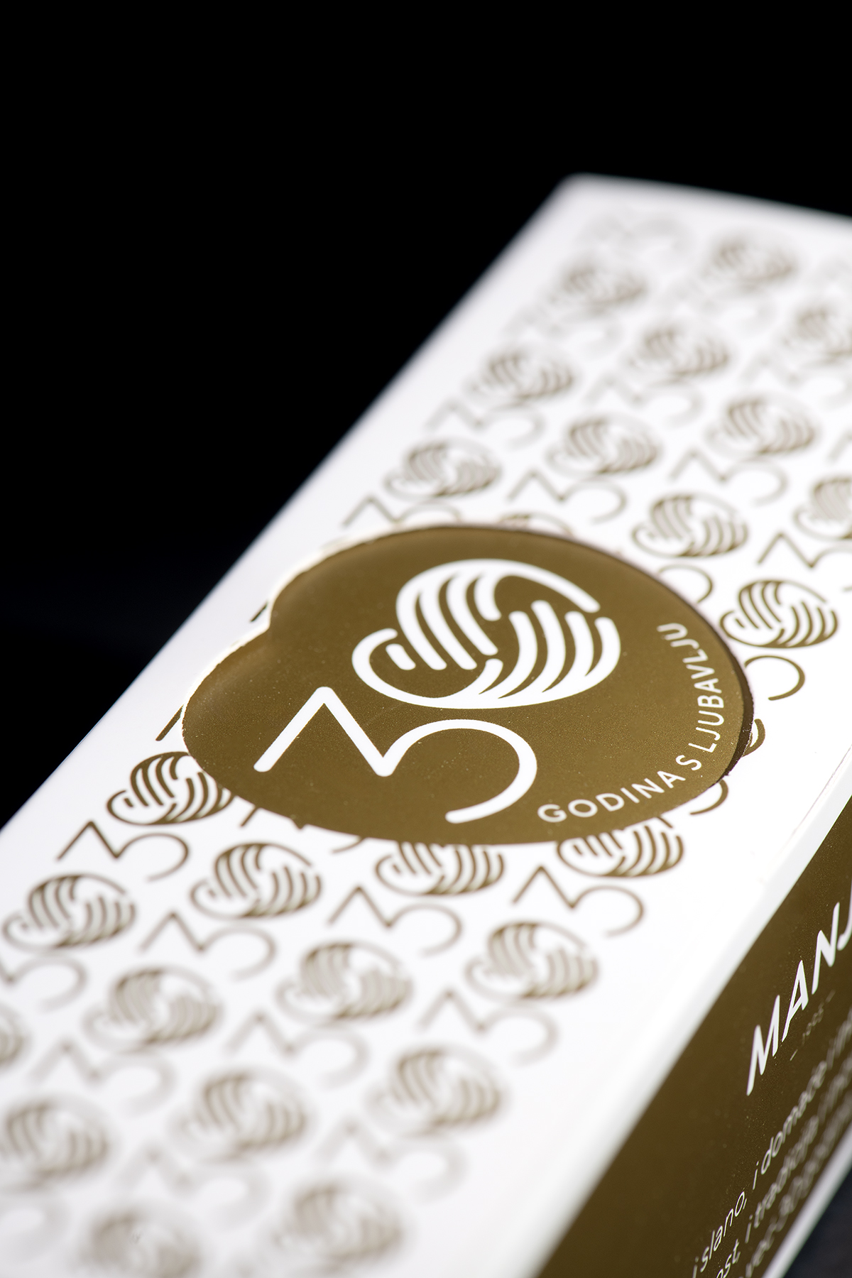
By adding the number 3, we created a simple, recognizable, and powerful anniversary mark that seamlessly combines the brand’s heritage with its thirty-year story.
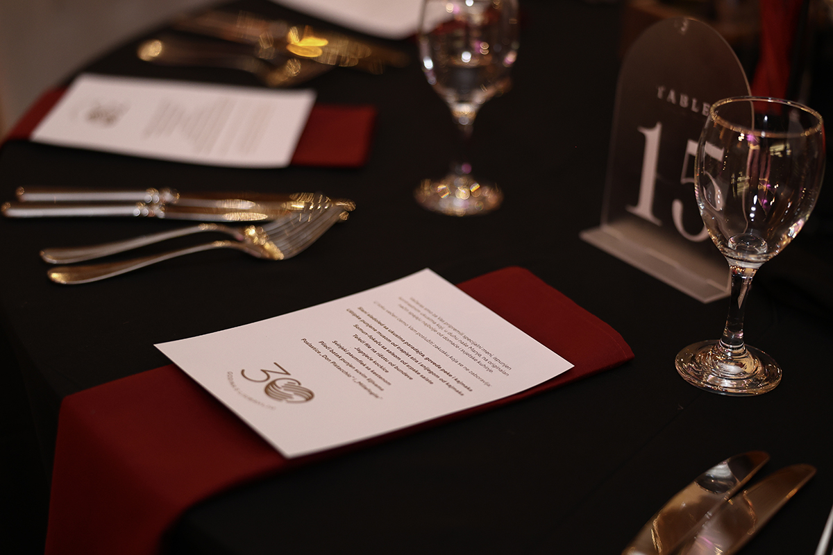
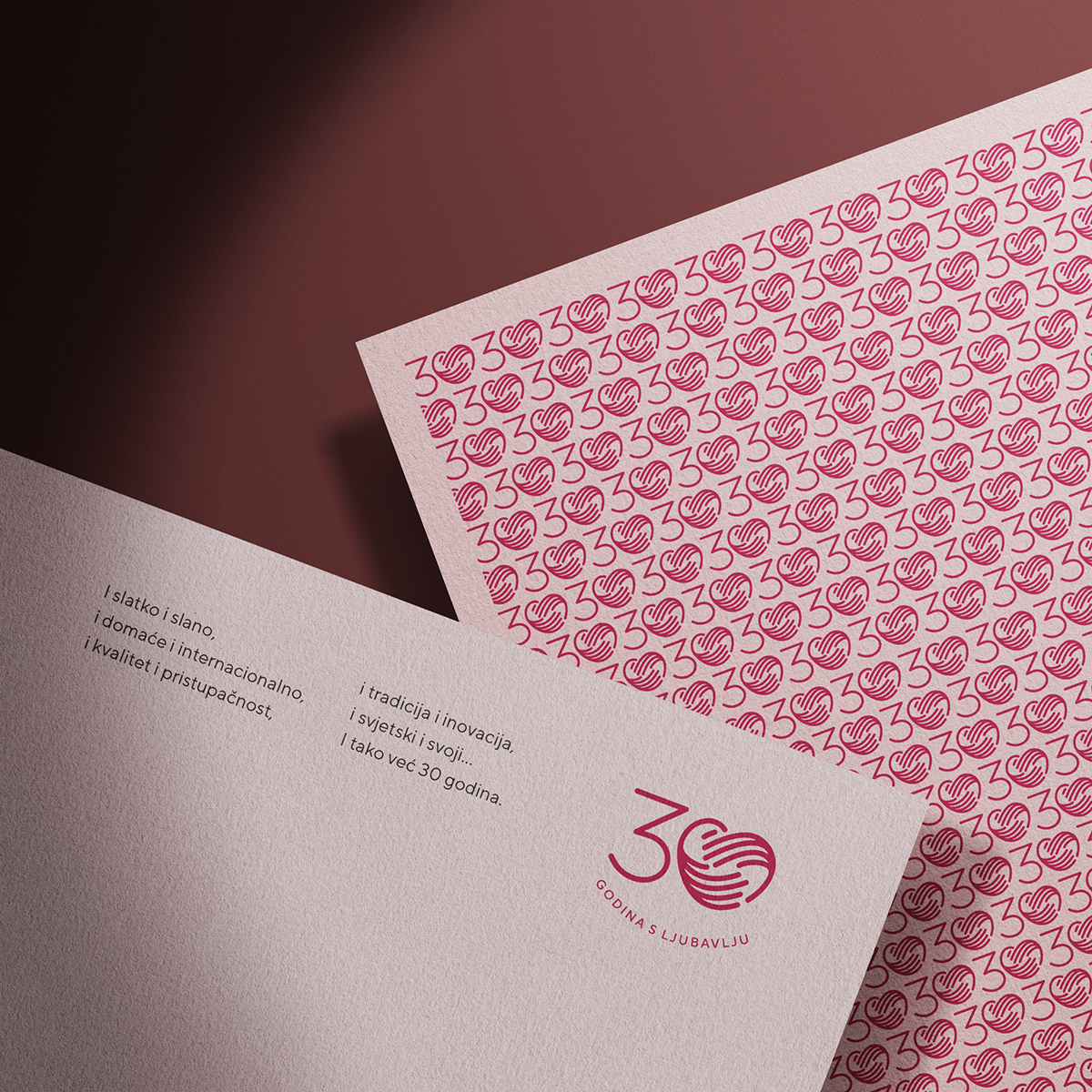
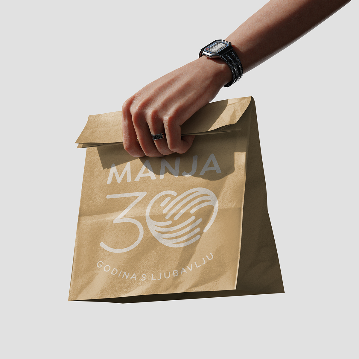
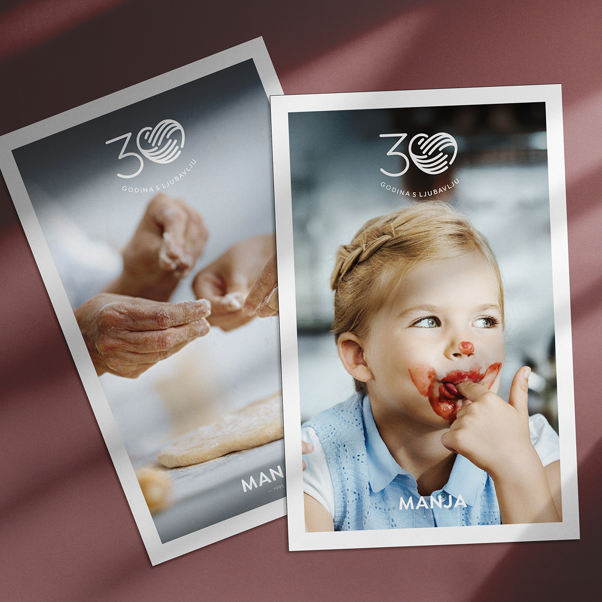
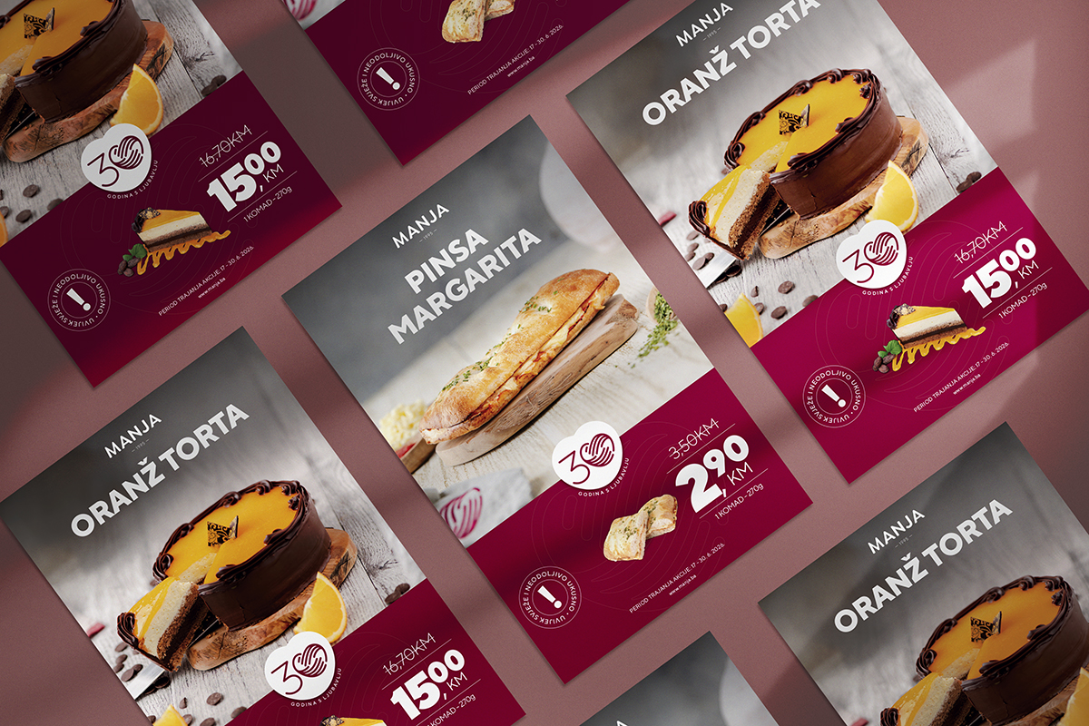
The visual identity was carefully designed to work across a wide range of formats and materials while maintaining strong recognition in every application—from digital channels and printed materials to products and event branding.
An Invitation That Becomes an Experience
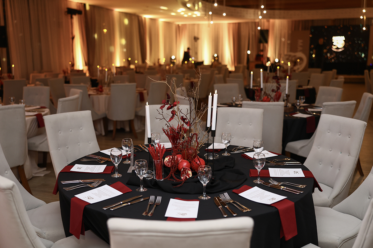
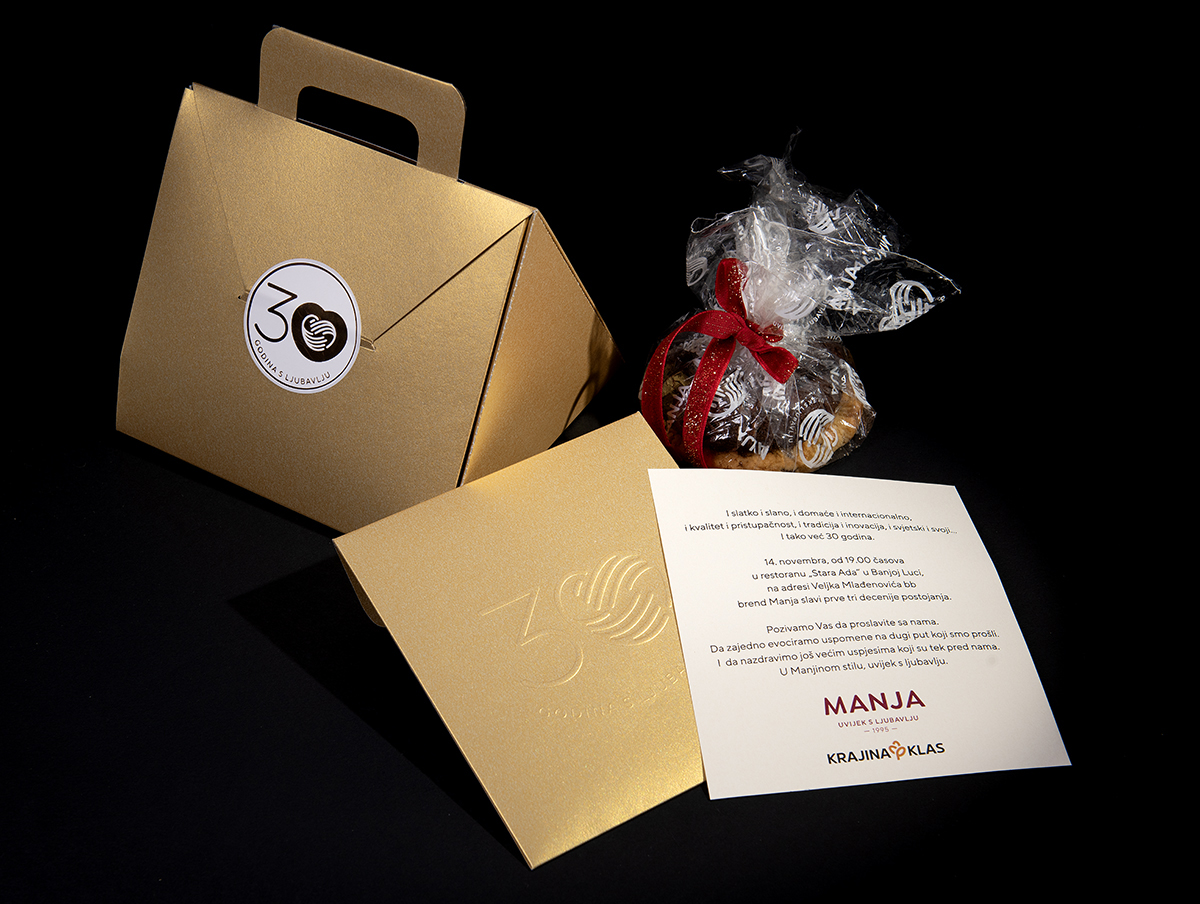
For the central anniversary celebration, we designed an invitation that moved beyond the boundaries of a traditional corporate format.
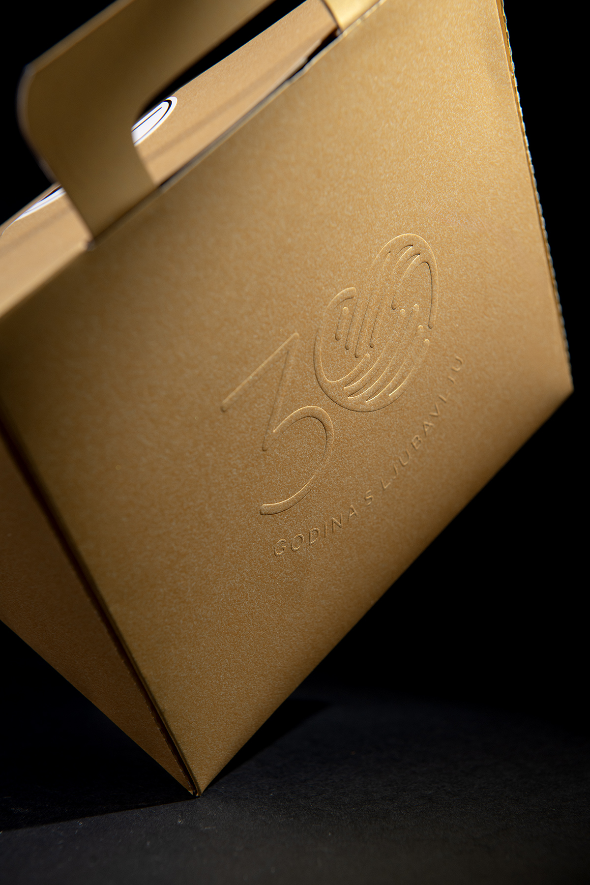
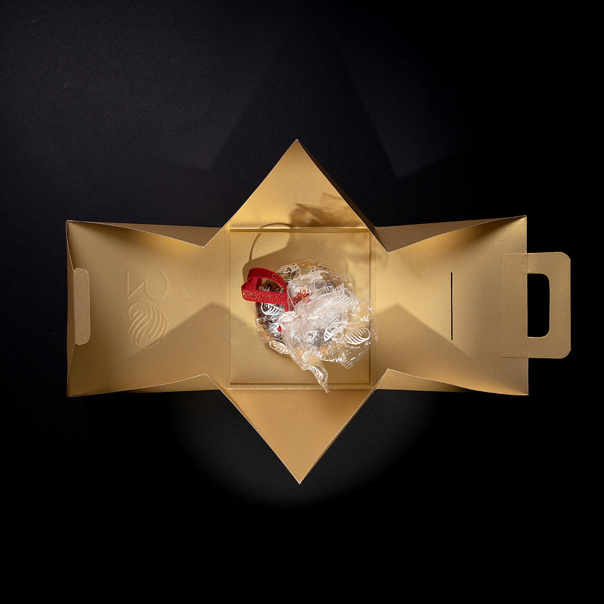
Instead of a classic envelope, a custom triangular prism-shaped package was created. Alongside the official invitation, it contained a sweet surprise in the form of carefully selected cookies. In this way, the invitation became more than an announcement—it became the guests’ first interaction with the experience awaiting them at the celebration itself.
Its minimalist form, gold accents, and subtle application of the anniversary symbol further emphasized the significance and elegance of the occasion.
Anniversary Product Editions
Throughout the anniversary year, the “30 Years Made with Love” mark was integrated into a wide range of communication and promotional materials, as well as specially created product editions.
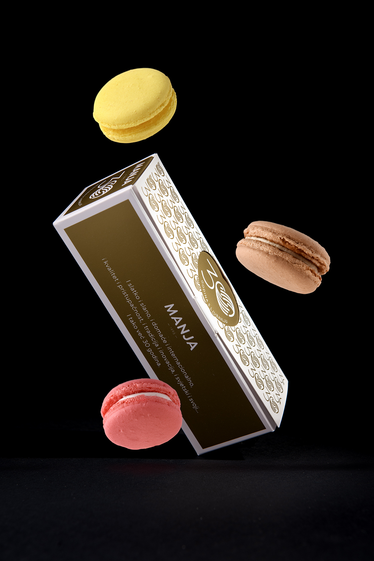
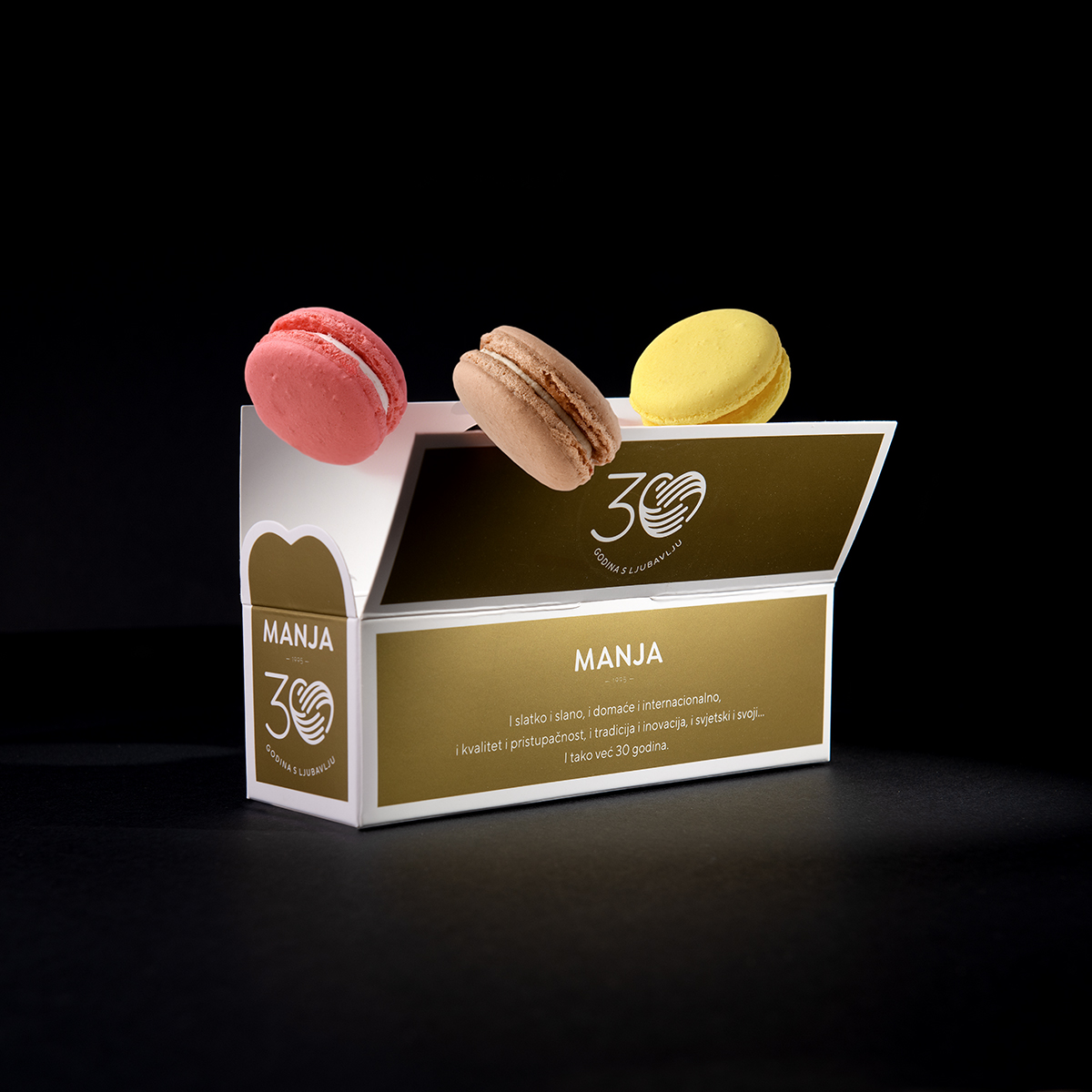
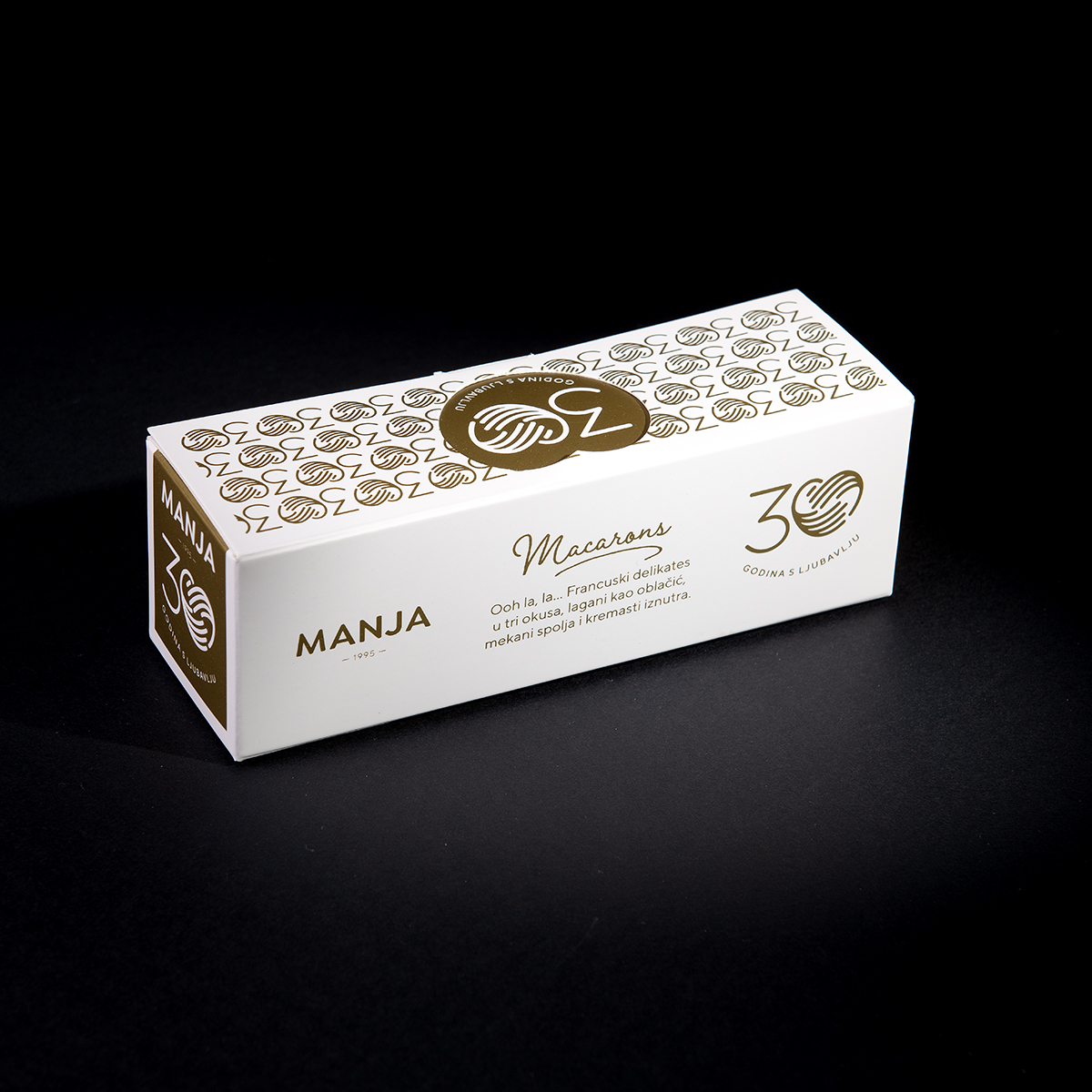
A standout piece of the project was the limited-edition Manja Macarons packaging, designed as a gift for guests attending the celebration. The packaging design was built around the rhythmic repetition of the anniversary symbol, creating an elegant visual system that communicated both exclusivity and the recognizable identity of the brand.
More Than an Anniversary
This project was about much more than celebrating thirty years of business.
It was an opportunity to tell the story of a brand that grew from a local bakery into one of the leading bakery and confectionery companies in Bosnia and Herzegovina.
Through a simple symbol, carefully crafted details, and a consistent visual language, the anniversary was transformed into a complete brand experience—one that connects the past, present, and future of Manja.